Case Study

Cens:ai Mobile App Design

Cens:ai is an iOS wellness app that uses heart-rate data from a wearable sensor to help people understand how stress, emotions and daily experiences affect their mental and physical state.

My Role

As Head of Design and the company’s sole designer, I led the product redesign from discovery through public beta. I owned the product strategy, user flows, information architecture, wireframes, visual design, prototypes, design system, usability testing, beta program, and App Store assets.

I worked directly with the founder and a single iOS engineer, collaborating closely on product priorities, technical feasibility, implementation and the evaluation of third-party biometric sensors.

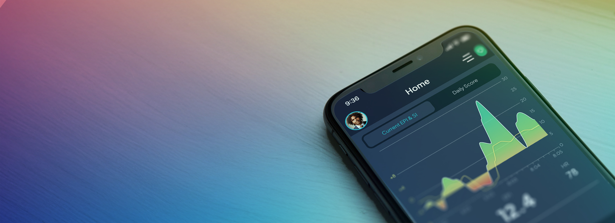
censai cover image

The Challenge

Design and build the flagship product for the company.

When I joined Evolve Biologix, Cens:ai was primarily a single meditation screen displaying heart metrics captured from a wearable chest strap. It showed users what their bodies were doing in the moment, but provided little explanation of what the metrics meant, why they mattered, or what users could do with that information.

There was also little reason to return outside of a meditation session. My goal was to transform the app from a passive biometric monitor into a more useful daily tool—one that helped users connect their heart data with sleep, focus, stress, emotions, activities and relationships.

The product also needed to support the company’s longer-term emotion-detection research. That created an important design challenge: deliver immediate value to users while gathering enough contextual information to make the underlying biometric data meaningful.

Product Overview

How it Works

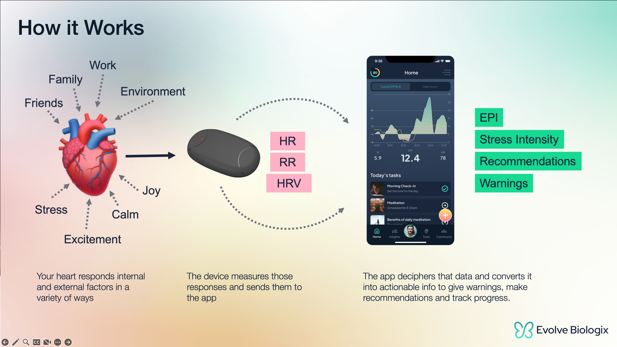
Diagram showing heart factors measured by a device sending HR, RR, HRV data to an app for stress and health info.

Heart patterns shift in response to both internal and external factors like stress, focus, and emotional state. I designed an experience around a biometric sensor that measures those shifts in real time, giving users immediate feedback on how their emotions are affecting them. From there, the app interprets the data into clear, actionable insights—offering guidance, surface-level trends, and progress tracking to help users build emotional awareness and resilience over time.

Combining quantitative and qualitative data

Cens:ai pairs with a heart-rate sensor to measure HRV and calculate heart coherence and arousal. These metrics are calculated second by second, providing live feedback during activities and meditation sessions.

The biometric measurements become more meaningful when combined with context supplied by the user, including their emotions, activities, surroundings, and relationships.

Quantitative Metrics

Evolve Power Index (EPI)

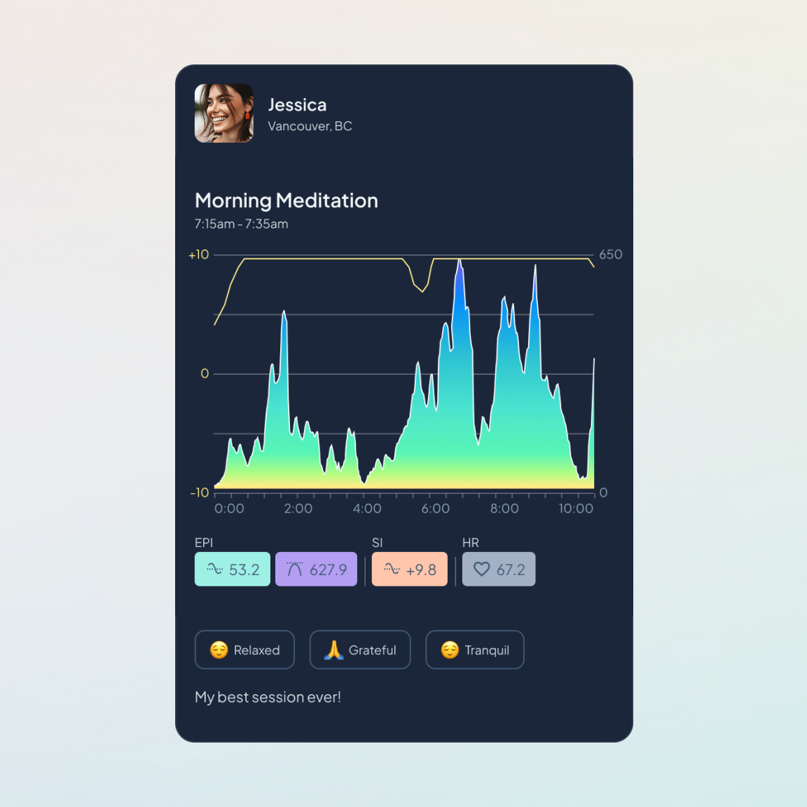
EPI is a proprietary score based on heart coherence. A higher score indicates a smoother, more coherent heart rhythm.

Stress Intensity (SI)

SI represents the user’s level of nervous-system activation. A higher score may reflect negative stress, excitement, or other forms of stimulation.

Qualitative Metrics

Emotions

Users can add emotions to recorded activities, helping them connect subjective experiences with changes in their biometric data.

Other External Factors

Context that cannot be detected automatically—such as who the user is with, what they are doing, or what they are thinking about—can be added manually.

Automated Factors

Calendar integrations can automatically associate events with the user’s day, while location data can add context to recorded activities.

What Shipped

The redesigned experience reached public beta through TestFlight and theApp Store. It included daily check-ins, intentions, biometric insights, afull-day journal, meditation sessions, group meditation, profiles, andcommunity features.

The beta reached approximately ten users before development ended, so there was not enough time or usage to measure retention or broader behavioral impact. The most meaningful early feedback was that users struggled to understand proprietary metrics such as EPI and SI. That led me to redesign the onboarding and supporting explanations so users could better understand what was being measured and how to interpret their results.

Turning biometric data into a daily practice

The starting point.

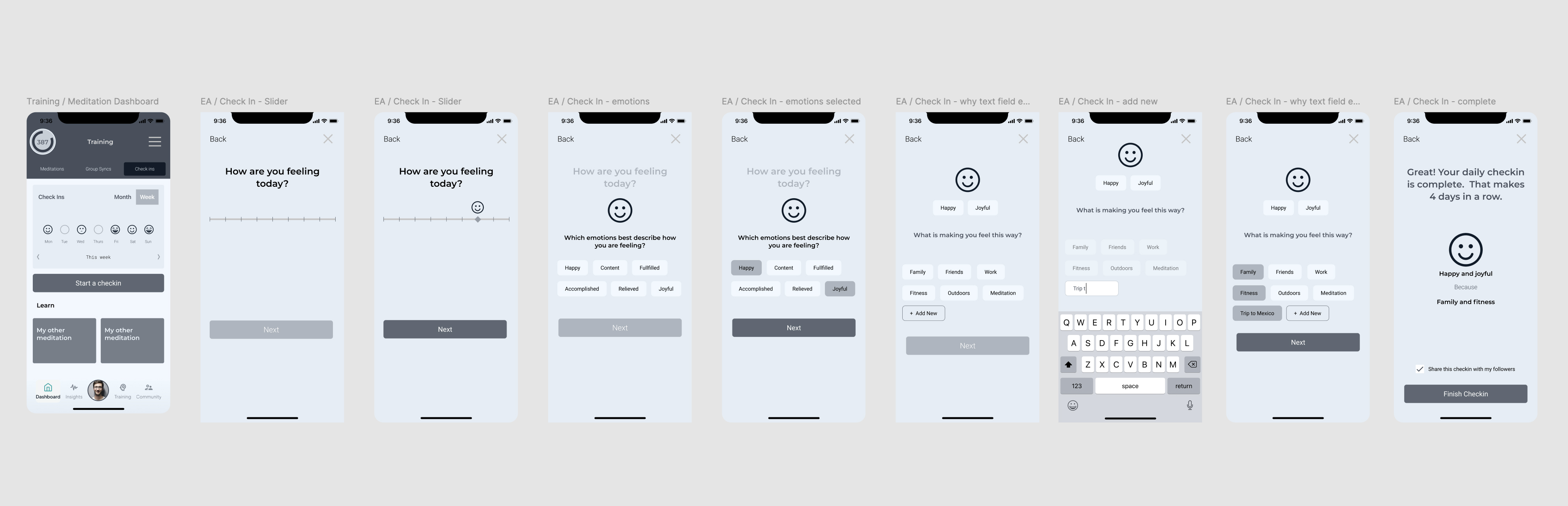
The original requirement was a simple emotion check-in: users would record how they felt and add tags describing what might be affecting them. That captured useful context, but it didn’t give users much value in return or create a meaningful reason to check in consistently.

Series of app screens showing a user check-in flow with mood selection, emotions, reasons, and completion message.

Expanding the check-in

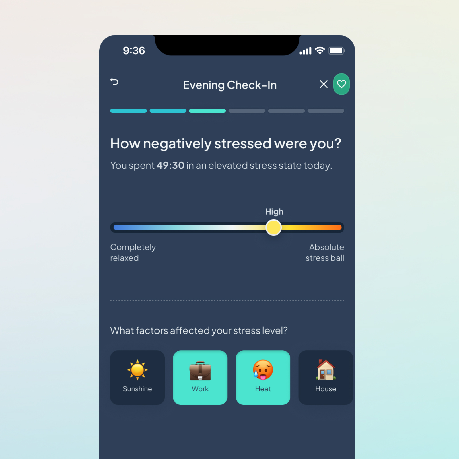
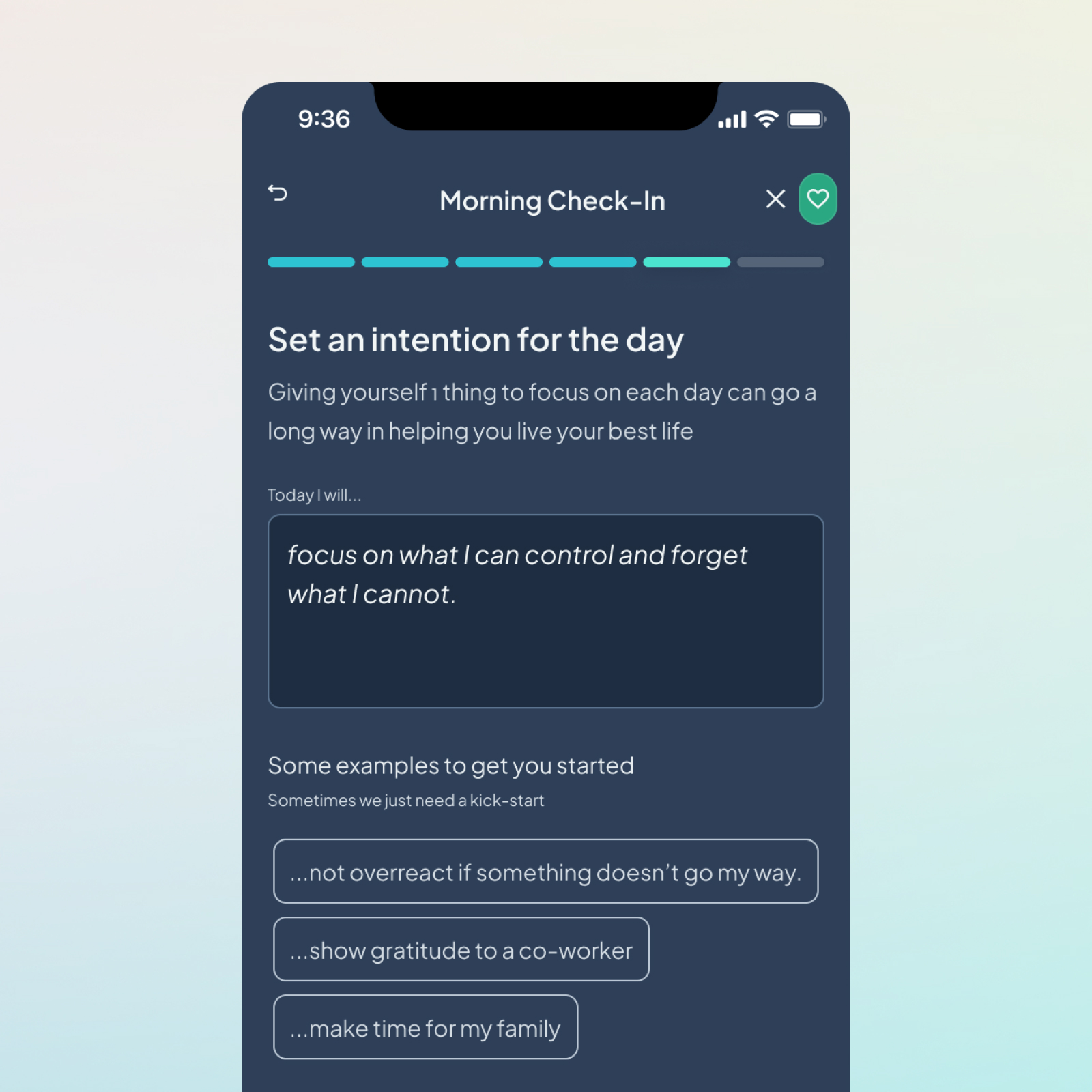
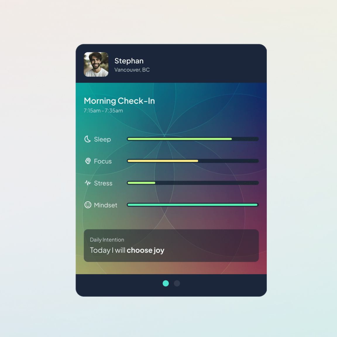
I expanded the flow to capture four factors—sleep, focus, stress, and general outlook—and added a daily intention. Together, these questions created a more complete snapshot of the user’s state while providing context that could later be compared with their biometric data.

A 30-second daily check-in

The final five-step check-in takes approximately 30 seconds to complete. Users rate each factor, identify what may be influencing it, and set an intention for the day.

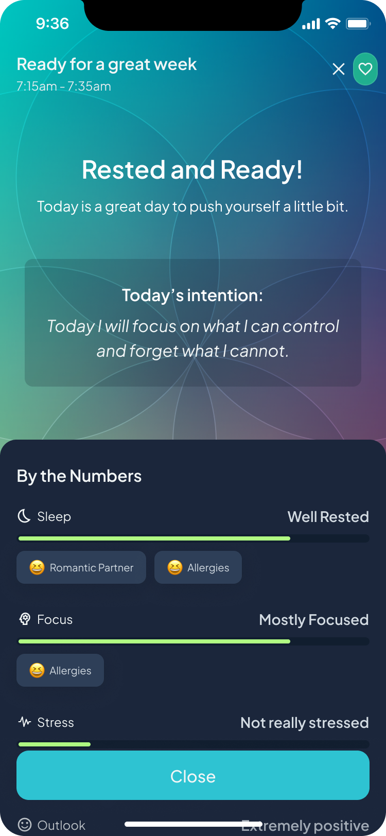
Personalized summary

After completing the check-in, users receive a concise headline and summary based on their responses.

Scannable responses

Color-coded indicators make it easy to review each response and understand the overall shape of the day.

Screen shows rest and readiness summary with sleep, focus, stress, and outlook ratings and today's intention.

Daily intention

The user’s intention remains visible in the summary as a reminder of what they want to prioritize.

Contextual factors

Tags capture the people, activities, and circumstances influencing each response, adding meaning to the biometric data collected throughout the day.

Connecting daily experiences to biometric trends

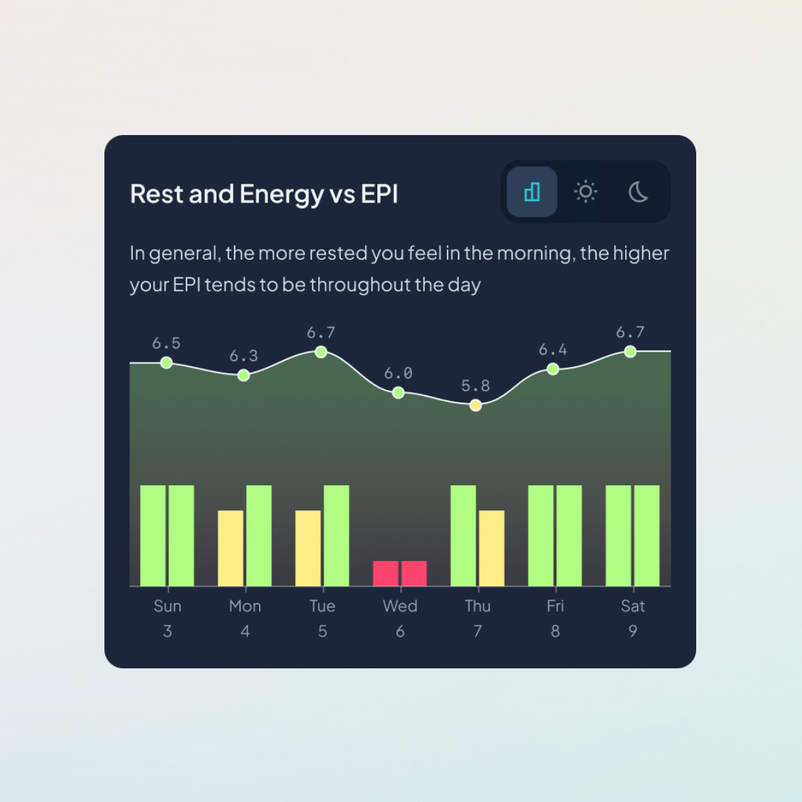
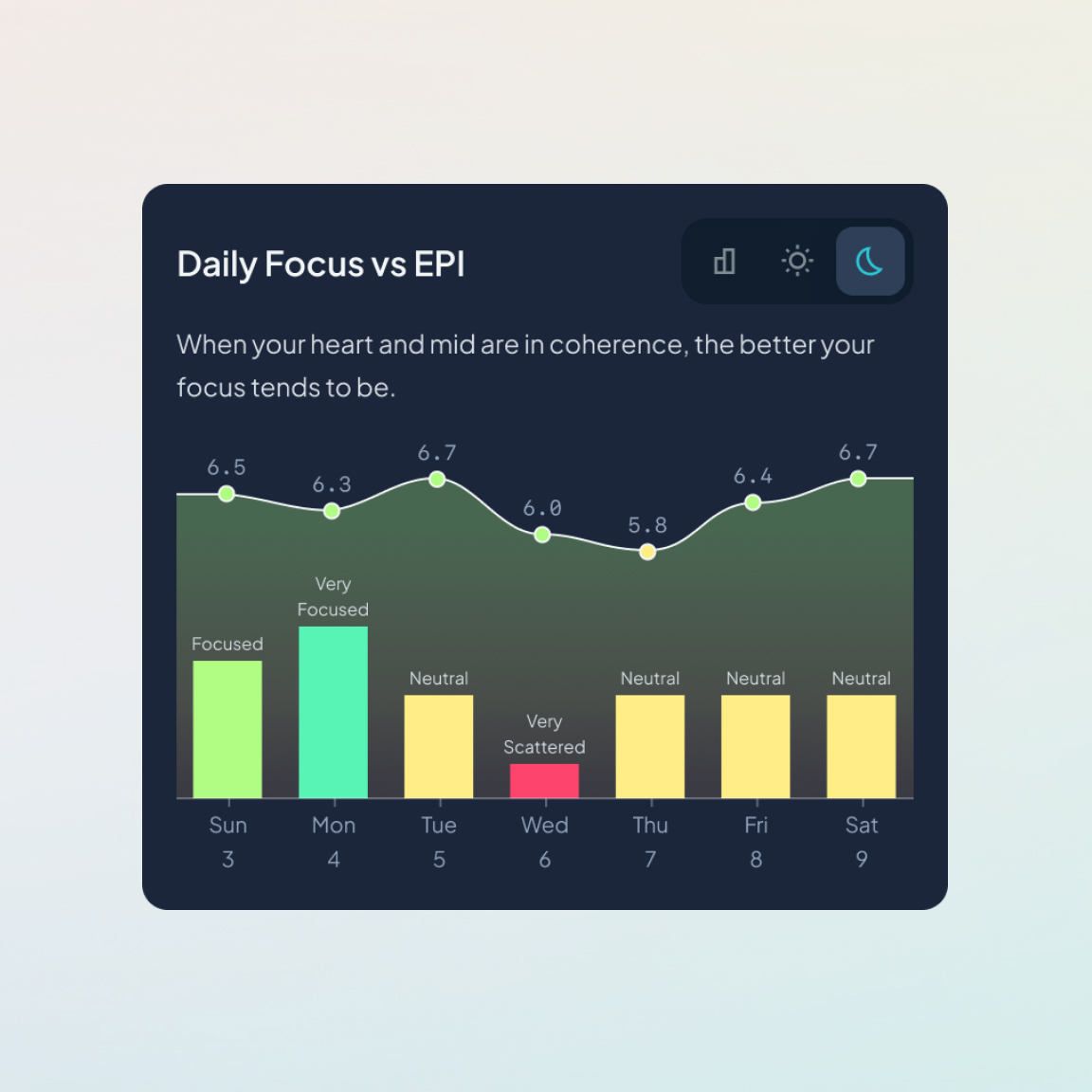
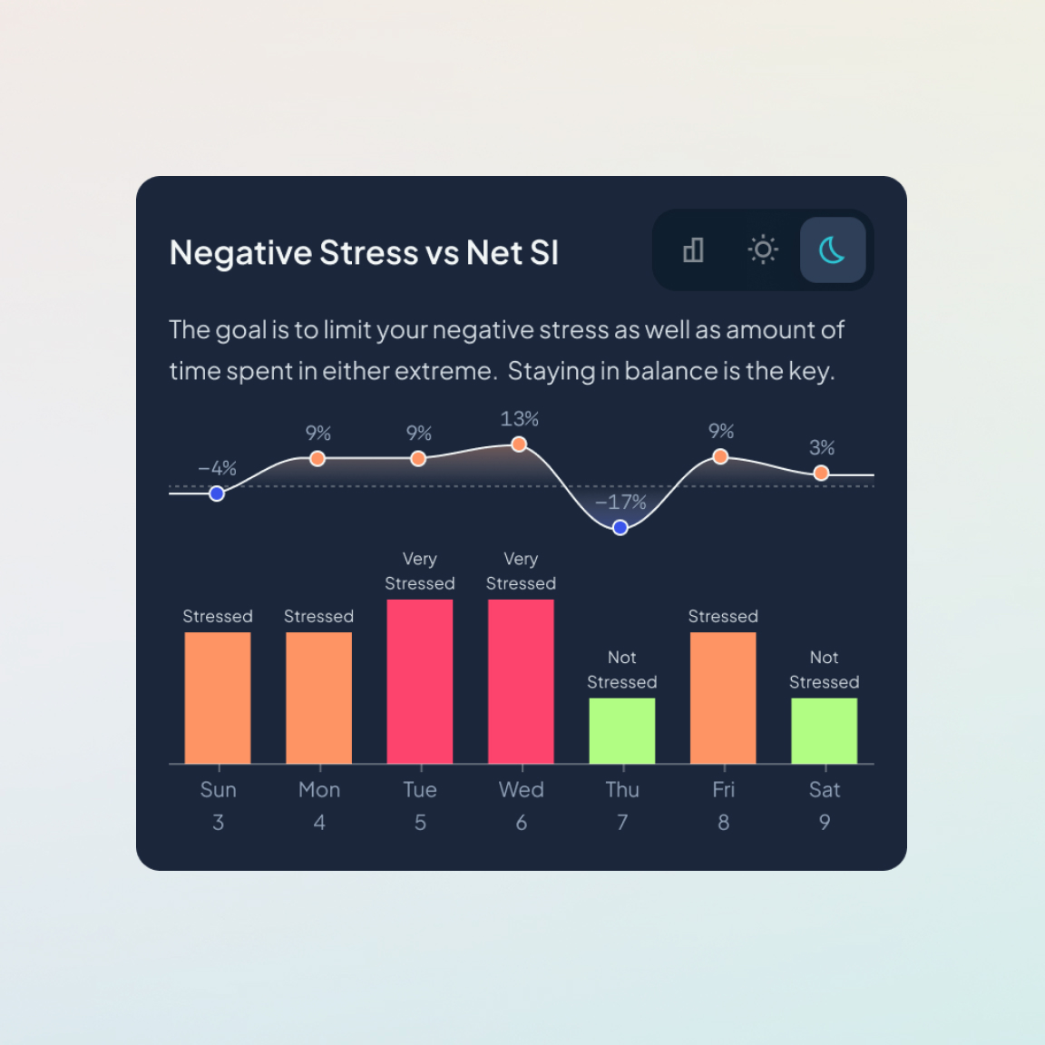
Collecting data was only useful if people could understand what it meant. I designed the Insights experience to compare self-reported factors such as sleep, focus, and stress with EPI and SI over time. Instead of presenting isolated scores, the charts help users look for relationships. For example, whether stronger sleep aligns with higher average EPI or whether periods of negative stress correspond with increased SI.

Testing the interaction

I created an interactive prototype to test the check-in flow, pacing, controls, and transition into the completed daily summary.

Making second-by-second data understandable

A daily average concealed too much variation to explain what happened throughout the day. At the same time, displaying every second of biometric data produced a chart that was too noisy to interpret.

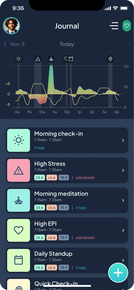
I grouped the data into 15-minute averages, making meaningful peaks and valleys easier to identify. These periods became the foundation of a daily journal that connected changes in the user’s metrics with check-ins, meditations, calendar events, and other activities.

See your full day at a glance

A simplified chart makes significant changes in EPI and SI easier to identify without requiring users to interpret every individual measurement.

Highlight meaningful moments

Check-ins, meditations, calendar events, and automatically detected changes are marked directly on the timeline.

Journal - dark mode

Add missing context

When the app detects an extended period above or below the user’s typical range, it creates an activity that the user can supplement with emotions, people, activities, or other relevant details.

Get the full story

Users can open any recorded moment to see its duration, associated context, and biometric response.

Designing meditation around focus

Redesigning the core experience

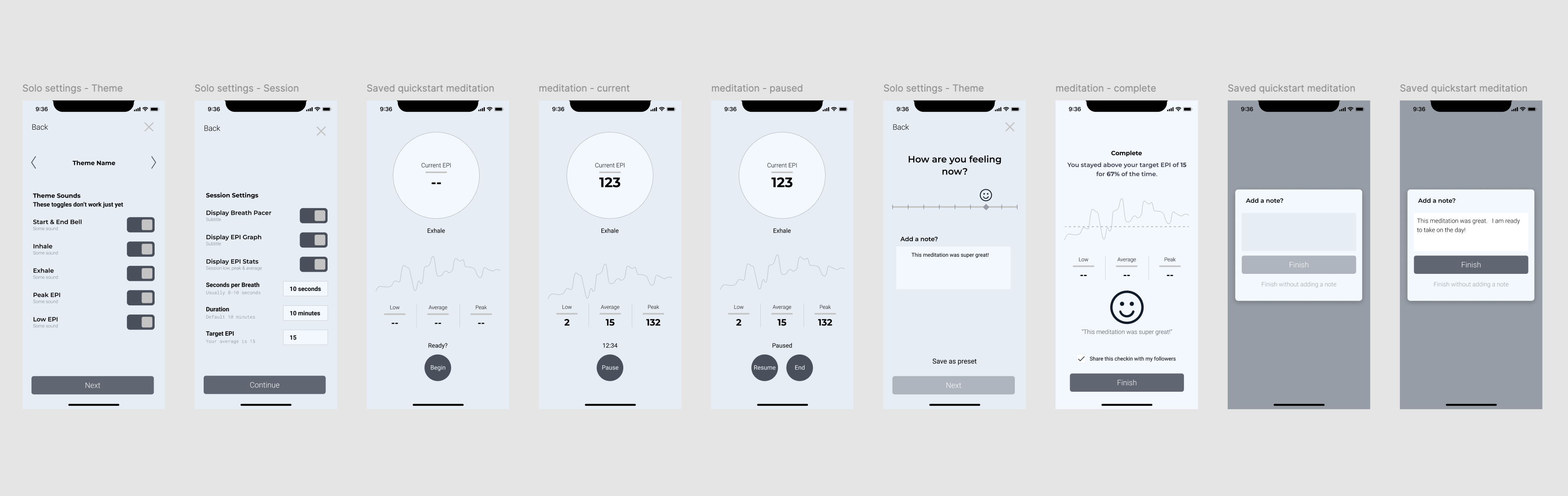
Meditation was the foundation of the original app, but the experience needed to do more than display a live score. I redesigned the flow from session setup through completion, including pacing controls, live feedback, customizable displays, ambient themes, and post-session results.

Original meditation flow wireframes

Designing for heart-coherence meditation

Heart coherence meditation uses slow, consistent breathing to encourage smoother heart-rate patterns. Because an effective breathing pace differs from person to person, users could adjust the timing and presentation of each session to fit their needs.

Support a soft focus

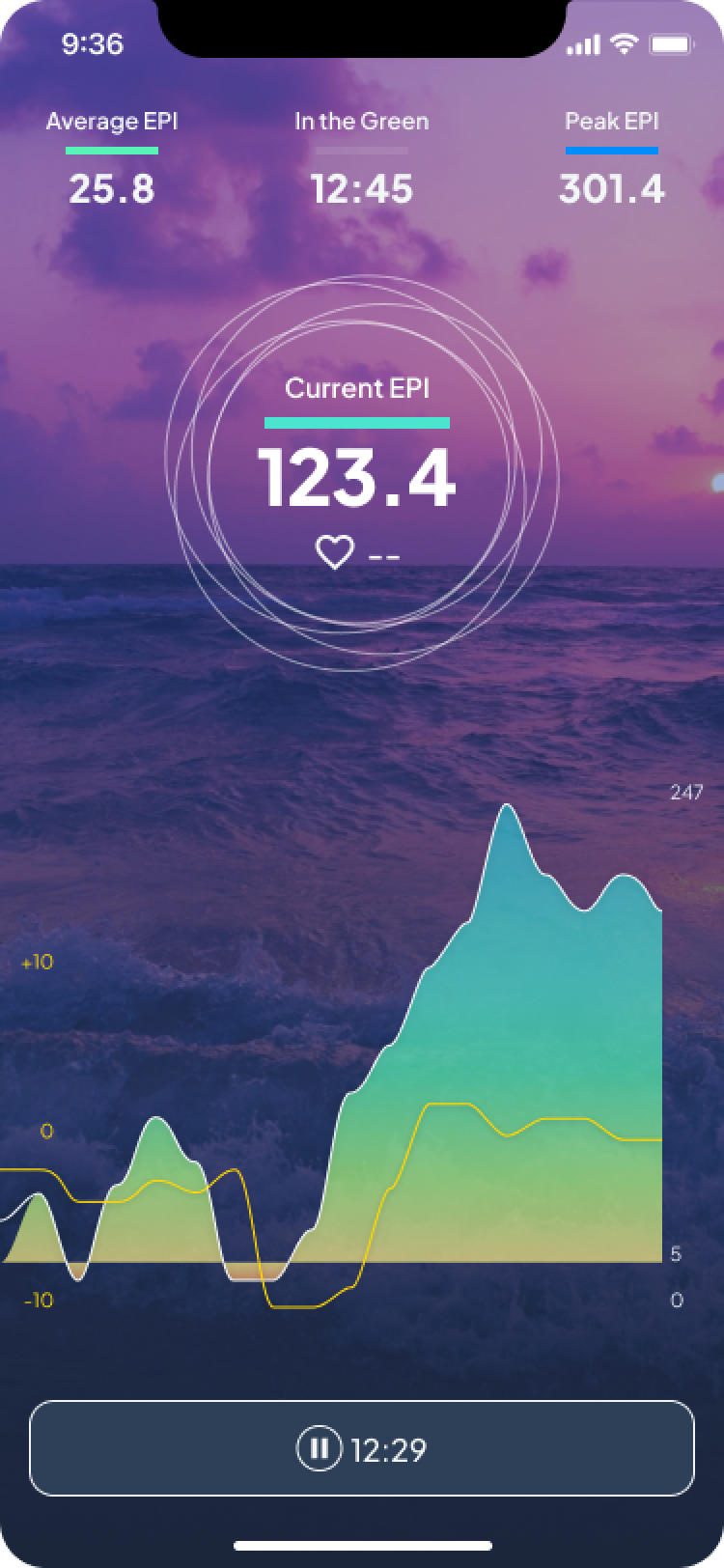
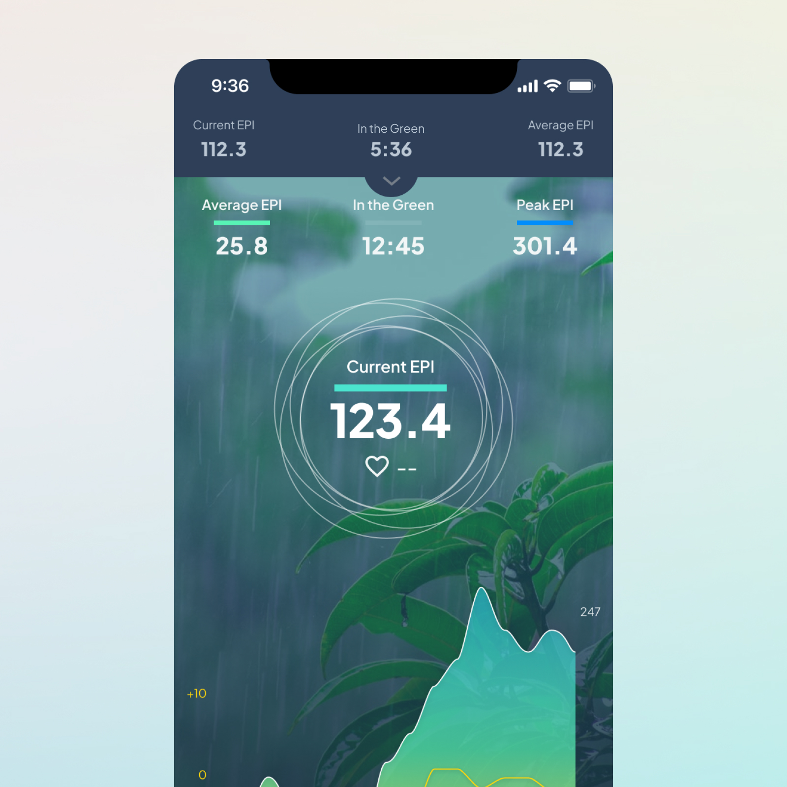
The primary metrics are grouped within one visual field so users can monitor the session without repeatedly shifting their attention around the screen.

Emphasize live progress

EPI and SI remain visible throughout the session, with the larger chart showing how the user’s measurements change over time.

Meditation app screen showing average, current, and peak EPI with a graph and a pause timer at bottom.

Remove distractions

Users can hide individual interface elements and choose how much live information they want to see.

Guided by sounds

Optional audio cues indicate when to inhale and exhale, allowing users to participate with their eyes closed.

Creating different environments for the same practice

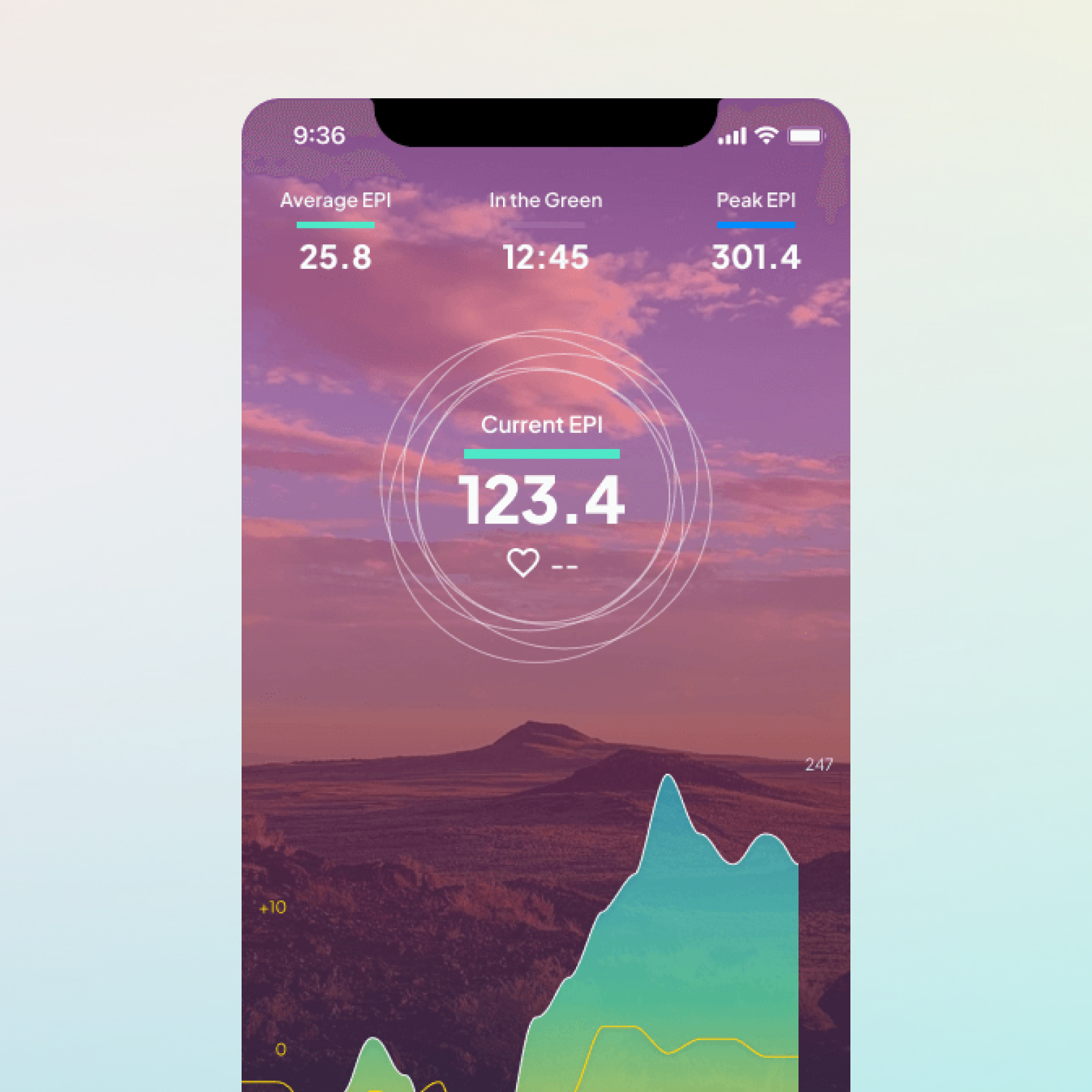
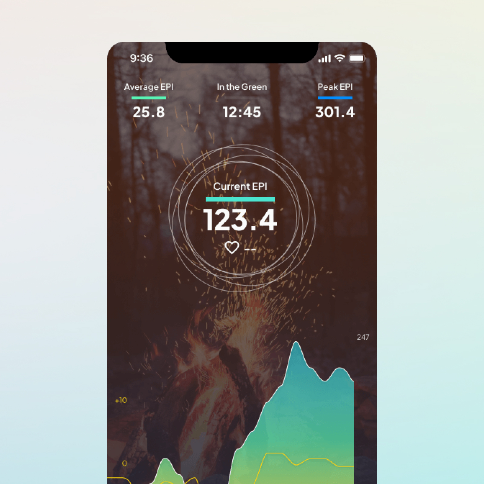
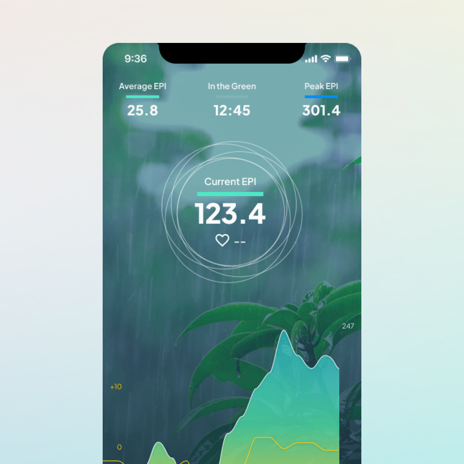
I designed four meditation themes, each combining a visual environment, ambient audio, breathing cues, and a visual breath pacer. The underlying interaction remained consistent so users could change the atmosphere without having to relearn the experience.

Extending meditation to groups

Group Syncs allowed people to participate in the same meditation session from different locations. The design challenge was to introduce the presence and progress of other participants without overwhelming an experience that depended on individual concentration.

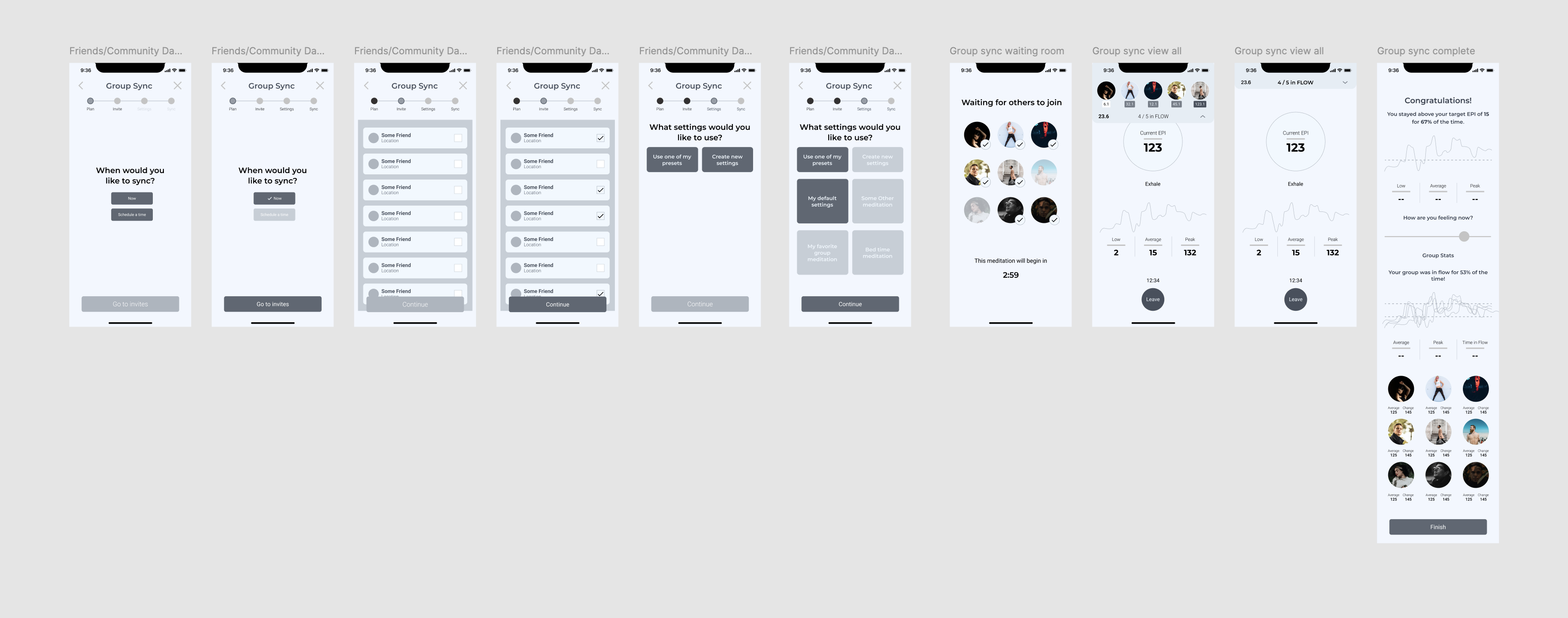
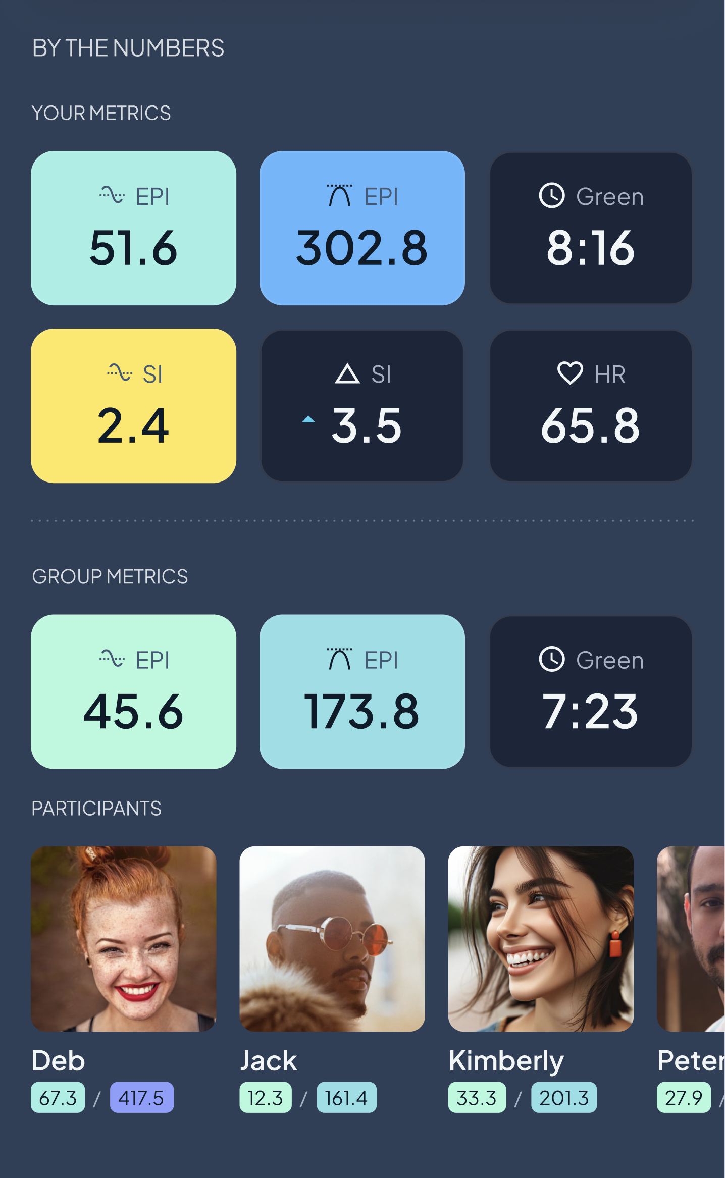
I began with the simplest useful version: joining or creating a session, waiting for participants, meditating together, and reviewing individual and group results afterward.

Original group meditation flow wireframes

Preserving the individual experience

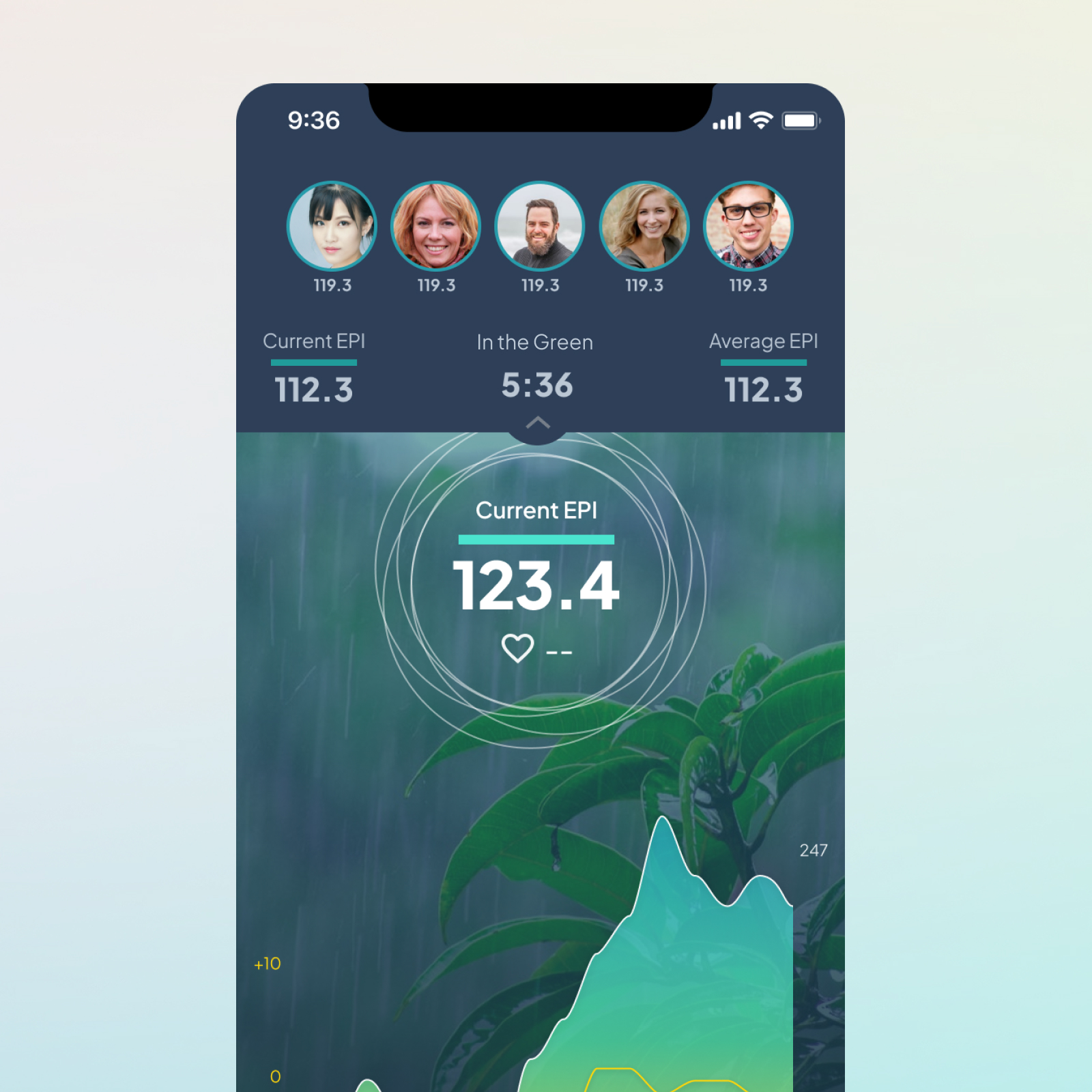
Rather than redesigning the meditation screen around the group, I wanted the individual experience to remain familiar and focused. Group information needed to be available without competing with the user’s own breathing and biometric feedback.

I added a collapsible overlay in the same area as the user’s existing session metrics. Showing every participant’s live chart created too much visual competition, so the interface emphasized aggregate group information while keeping the user’s own data primary.

Building a supportive community layer

From a friends list to a private activity feed

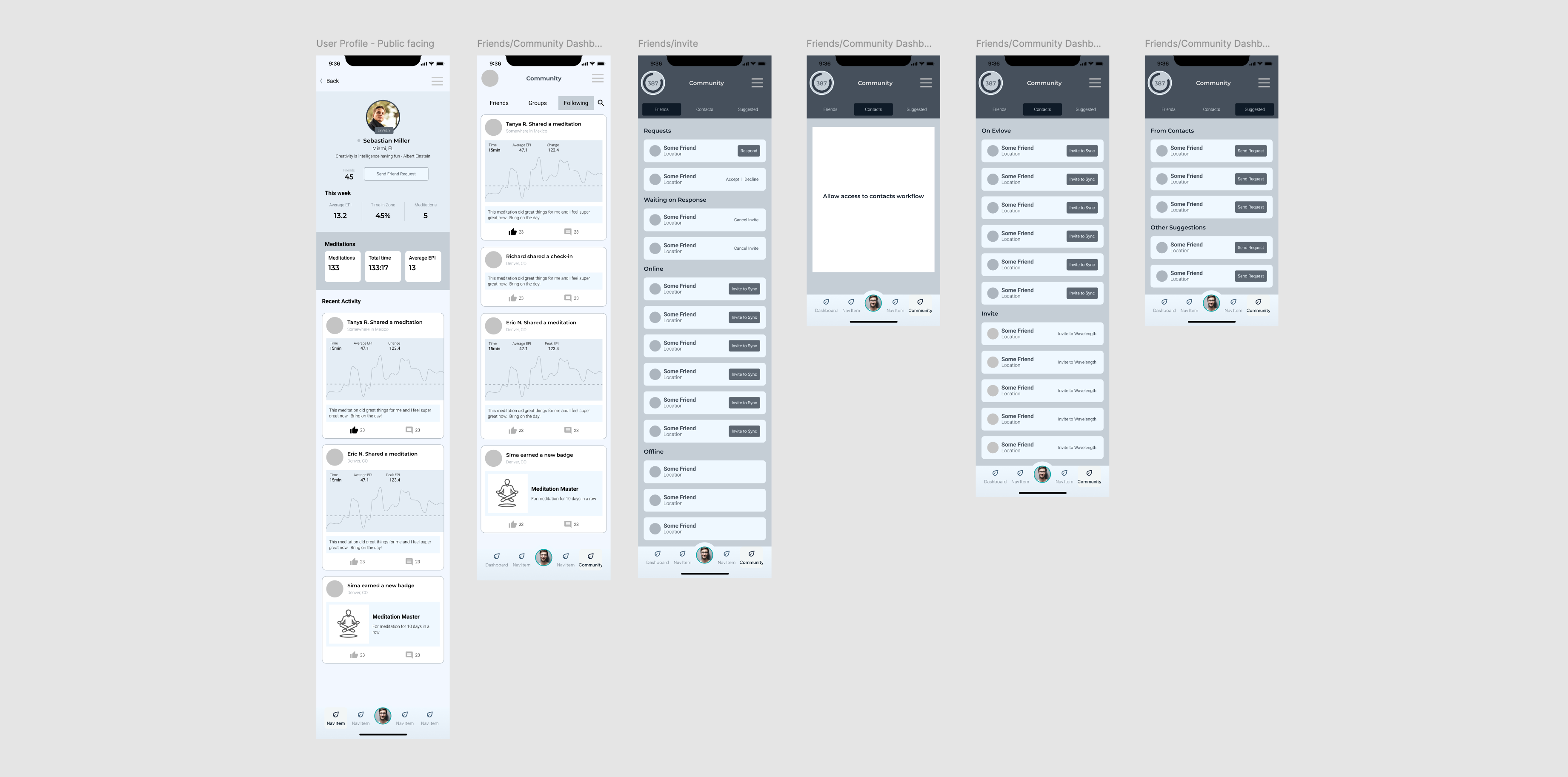
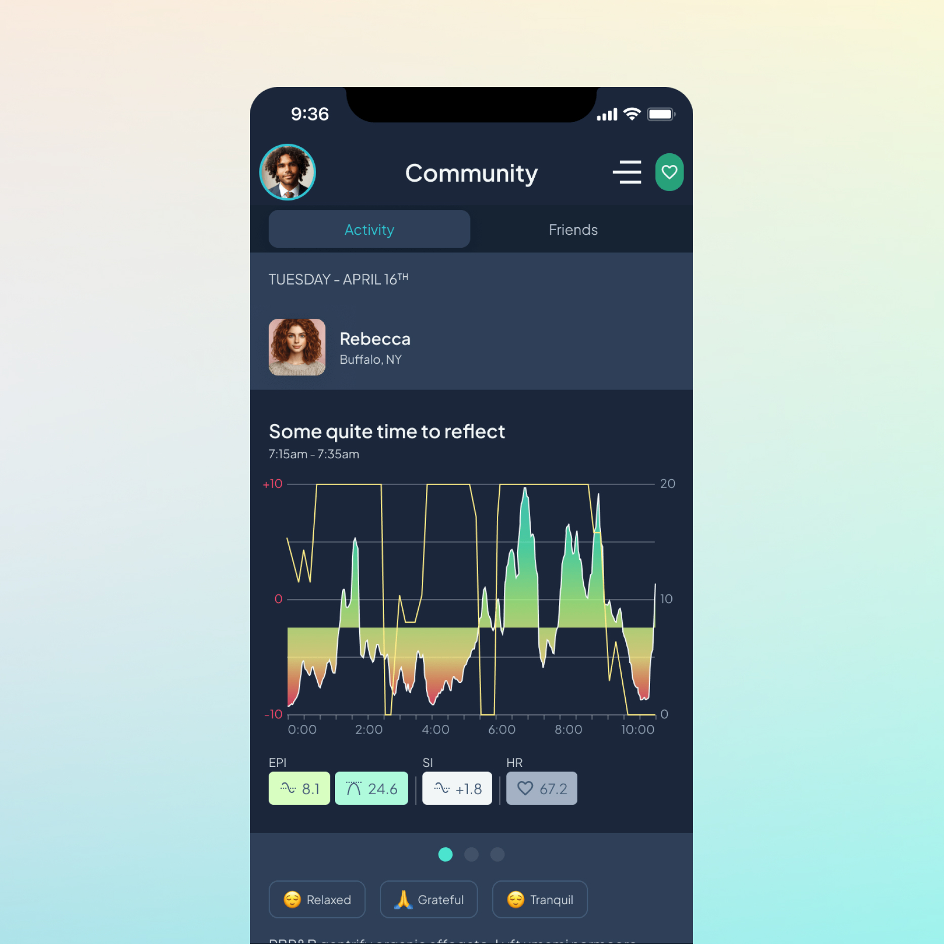
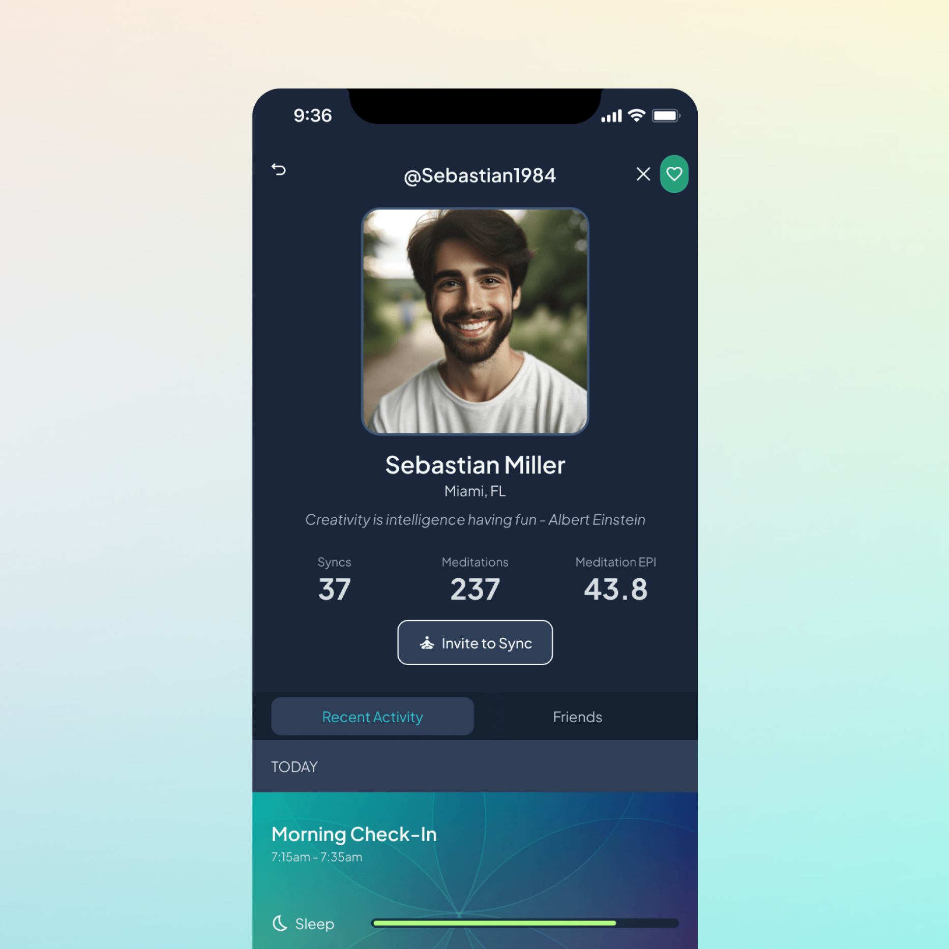
The original community experience consisted primarily of a friends list. I expanded it into a private activity feed where connected users could share check-ins, meditation sessions, and meaningful moments from their day.

Original community section wireframes

Designing for meaningful connection

The concept was intended to make the community feel more purposeful than a traditional social feed. Users could see when a friend completed a meditation, reached a personal milestone, or might benefit from encouragement, while retaining control over whether their activity was shared.

What users could share

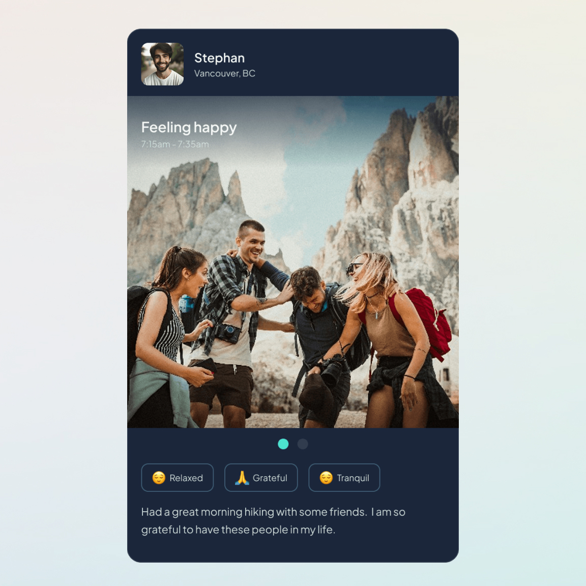
The beta supported several post formats so activity could be shared consistently while still reflecting the different ways users engaged with the product.

Exploring the community experience

I created this prototype to explore feed interactions and demonstrate how the community experience adapted between light and dark modes.

Conclusion

Although Cens:ai’s beta ended before we could measure retention or long-term behavioral impact, the project took the product from a single biometric meditation screen to a complete iOS experience released through TestFlight and the App Store.

The early response also reinforced how important context and explanation are when asking people to interpret unfamiliar health data. Feedback about EPI and SI led me to improve the onboarding and supporting guidance, making the product’s core metrics easier to understand.

This project required me to turn an ambitious and technically complex idea into a coherent product—balancing immediate value for users, the needs of the underlying research, and the realities of building with a very small team.