Traba was a culture-first job-discovery platform that helped people find roles based on more than a job title. Users could explore companies by culture, location, and industry; learn what working there might actually be like; and discover relevant open positions.
As Traba's sole designer and frontend engineer, I owned the brand and product experience from concept through implementation — visual identity, marketing site, company-discovery experience, filtering system, and company profiles. I built the production frontend in HTML, CSS, and JavaScript within a Rails application, working alongside a primarily three-person team to turn early product ideas into working experiences shaped by observed user behavior.


Traditional job boards centered the search around titles, requirements, and compensation but provided little insight into what working for a company might actually feel like. Traba paired job discovery with the context that surrounds it — we wanted people to find open roles at companies whose culture, values, and environment actually fit them, not just companies that fit their next job title. That required us to collect fragmented information from across the web, organize it into something useful, and create a discovery experience that made an unfamiliar way of searching for work feel intuitive.
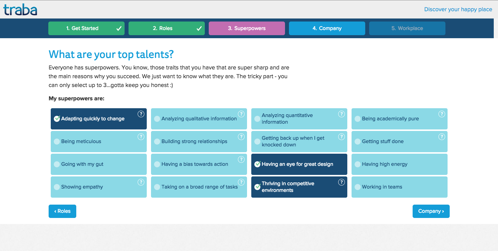
Company discovery wasn't only browse-and-filter. New users moved through a short, five-step onboarding — roles, superpowers, company, and workplace preferences — that captured what mattered to them beyond a job title. We matched those answers against how companies described themselves, connecting people to roles and cultures that actually fit.

One step of the five-step onboarding flow — users selected their top strengths, later matched against how companies described their own culture and team.
The product gave job seekers several ways to discover and evaluate companies:
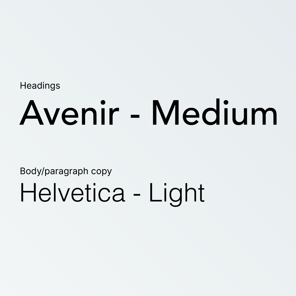
Traba's mission was to make the job search feel less transactional and discouraging. I created the brand around the idea of "Make Work Happy," using an approachable visual identity and a more optimistic voice to differentiate the experience from traditional job boards.
This was also my first opportunity to build a brand as a complete system rather than beginning and ending with a logo, color palette, and isolated marketing assets. The identity needed to work across the marketing site, product interface, company content, and job-search resources.


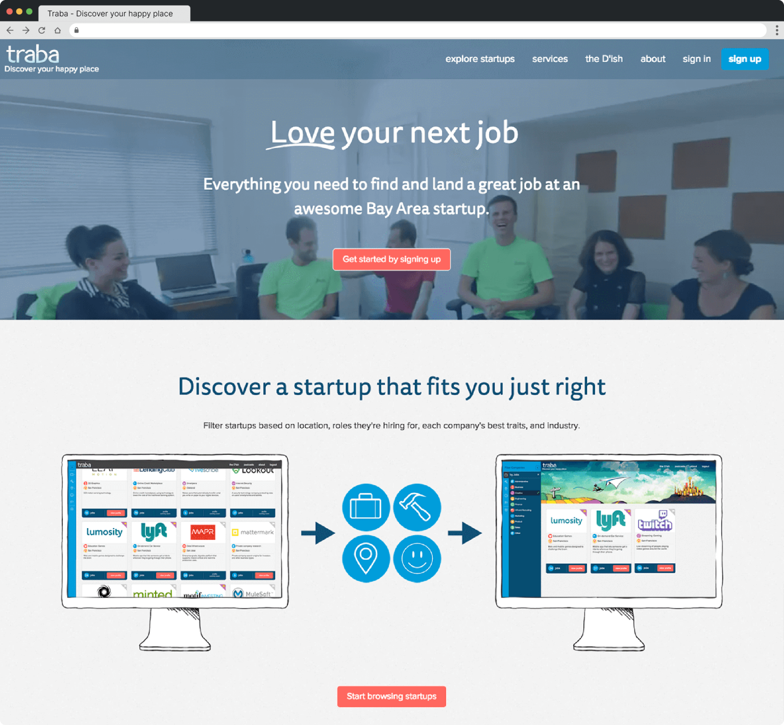
The marketing site introduced Traba’s culture-first approach and directed users into company discovery. The brand needed to make the experience feel optimistic and approachable while still explaining a search model that was unfamiliar to most job seekers.

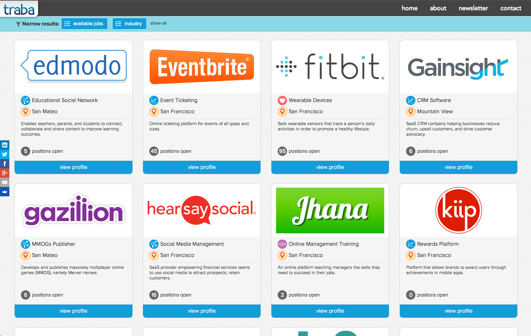
The discovery experience needed to support a large and varied collection of companies without asking users to begin with a specific job title.
I organized the experience around the qualities users cared about in an employer, allowing them to browse broadly or narrow the results by culture, industry, location, and other company characteristics.
Company cards exposed enough information for users to compare potential employers without requiring them to open every profile. The visual system also needed to accommodate companies with dramatically different brands and varying amounts of available content without making the results feel inconsistent.
An established pattern wasn't necessarily the right pattern.
For the initial filtering experience, I followed a layout similar to Amazon's interface at the time. It was a familiar pattern used by a successful product, and I assumed that familiarity would make the filters easier to use.
Once the experience was live, however, we saw relatively little interaction with the filters. Rather than continuing to rely on the assumption, I created an alternative layout that placed the filters in a persistent left-hand column.
We used Crazy Egg heatmaps and click counts to compare how people interacted with the two versions. The left-side filters received noticeably more attention and engagement, so I redesigned the discovery experience around that layout.
Original Layout

Filters appeared above the results, following a familiar ecommerce pattern.
Revised Layout

Persistent filters on the left received noticeably more attention and interaction in Crazy Egg
The experiment changed how I approached established design patterns. A familiar solution can be a useful starting point, but it still needs to be evaluated within the context of the actual product and its users.
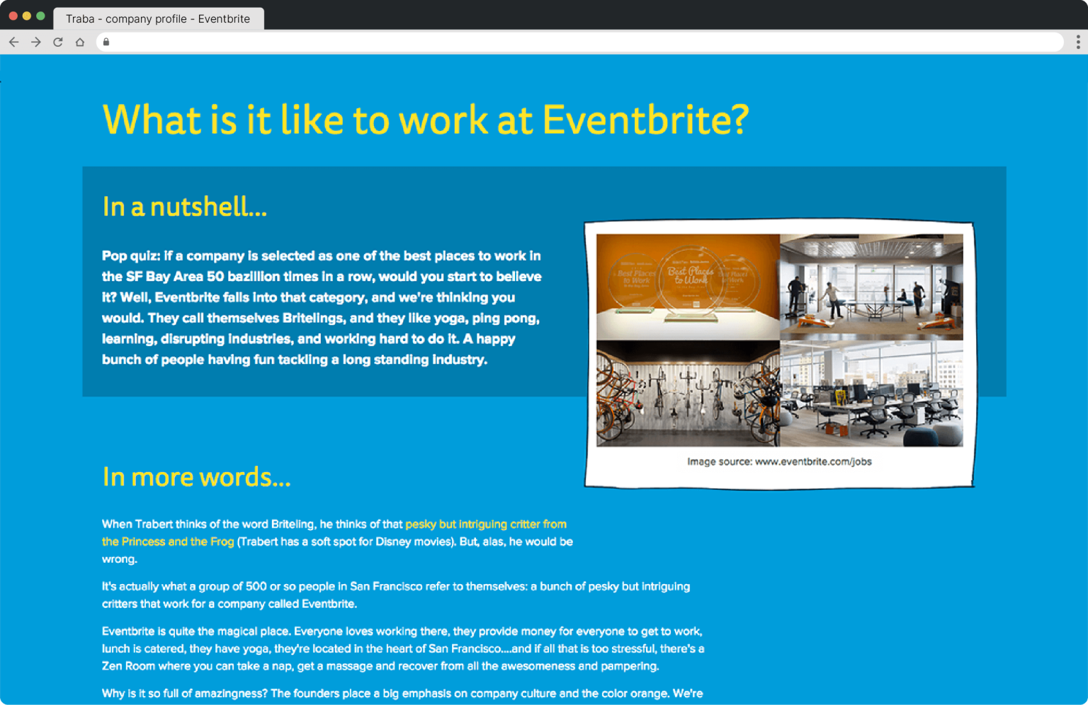
Information about an employer was usually scattered across its website, social channels, videos, and job board. We manually gathered that content and organized it into a consistent profile designed to answer a more human question: what might it actually be like to work here?
Each profile brought together information about the company's work, culture, people, and environment in a format that was easier to scan and compare.


Company profiles also included current openings pulled from the organization's job board. Users could explore available roles and filter them by department without leaving Traba, connecting the culture-first discovery experience with an actionable next step. Job listings sat alongside Traba's broader career resources — resume guidance, interview prep, and networking support — extending that same culture-first discovery into the job search itself.

Traba ultimately shut down when the company was unable to secure additional funding. During its final six months, however, site traffic grew approximately 10% week over week.
As the sole designer and frontend engineer, I had the opportunity to shape the complete experience — from brand and product strategy through production HTML, CSS, and JavaScript. The filter experiment became a principle I've carried into every project since: a familiar pattern is a starting point, not a verdict — the product and its users still get the final say. It's shaped how I evaluate new tools and conventions today, including how I think about AI-assisted design patterns now that borrowing has never been easier.