Nitro had grown into a global, soon-to-be-public SaaS company without ever settling on one brand identity — different teams pulling in different directions, no shared voice tying the product, marketing, and sales experience together. When I was promoted to Creative Team Lead, unifying that identity became my first initiative, and I owned it end to end: research, strategy, the visual system, and the six-month rollout that followed.
I led the entire process including competitive research, stakeholder interviews, team brainstorms, and creative concepting. I also directed the entire rollout which included a website re-architecture, redesign and rebuild.

I wanted to ensure that the Nitro brand reflected the company values, core culture, and growth as an organization. I also wanted to evolve the brand to a cohesive, enterprise-grade voice and aesthetic—without losing our unique personality and spirit.
Rather than start with visuals, I started with research: competitive audits, stakeholder interviews, and workshops with the global marketing team. I also sat down directly with our CEO to understand what he saw as the core of Nitro — its "soul." After several hours of debate across those sessions, we landed on three pillars to guide every decision that followed:
Bold, Helpful & Authentic
The goal wasn't a tagline. It was a filter I could apply to every design choice from that point forward, from the shape of the logo to the tone of a sales email.
The logo evolved from Nitro's existing mark rather than replacing it outright — the icon nods to both documents and steps, and I hand-adjusted a custom typeface based on Inter, character by character.
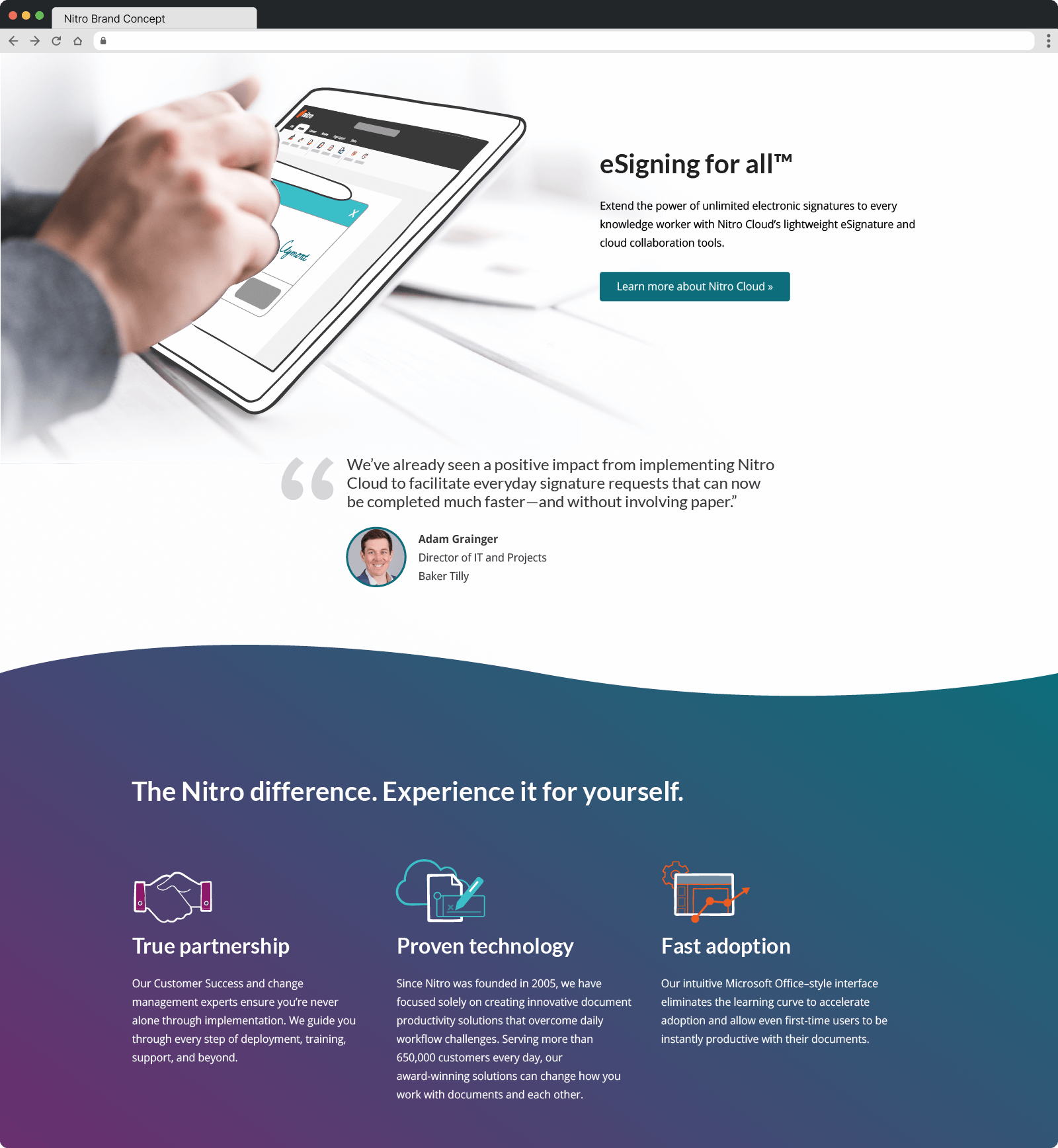
From there, I built systems designed to scale across a whole creative team, not just my own work: a hand-drawn illustration style paired with real photography for warmth, a shared brush library so that hand-drawn feel could be replicated by teammates and freelancers alike, and a consistent icon set maintained in our team library. To keep the brand consistent as it moved from design file to shipped product, I also built a library of inline SVGs and CSS classes for the curve and gradient elements that ran through the site, so developers could implement them the same way every time.


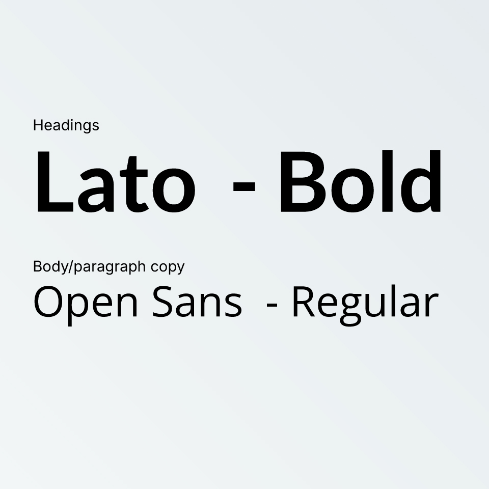
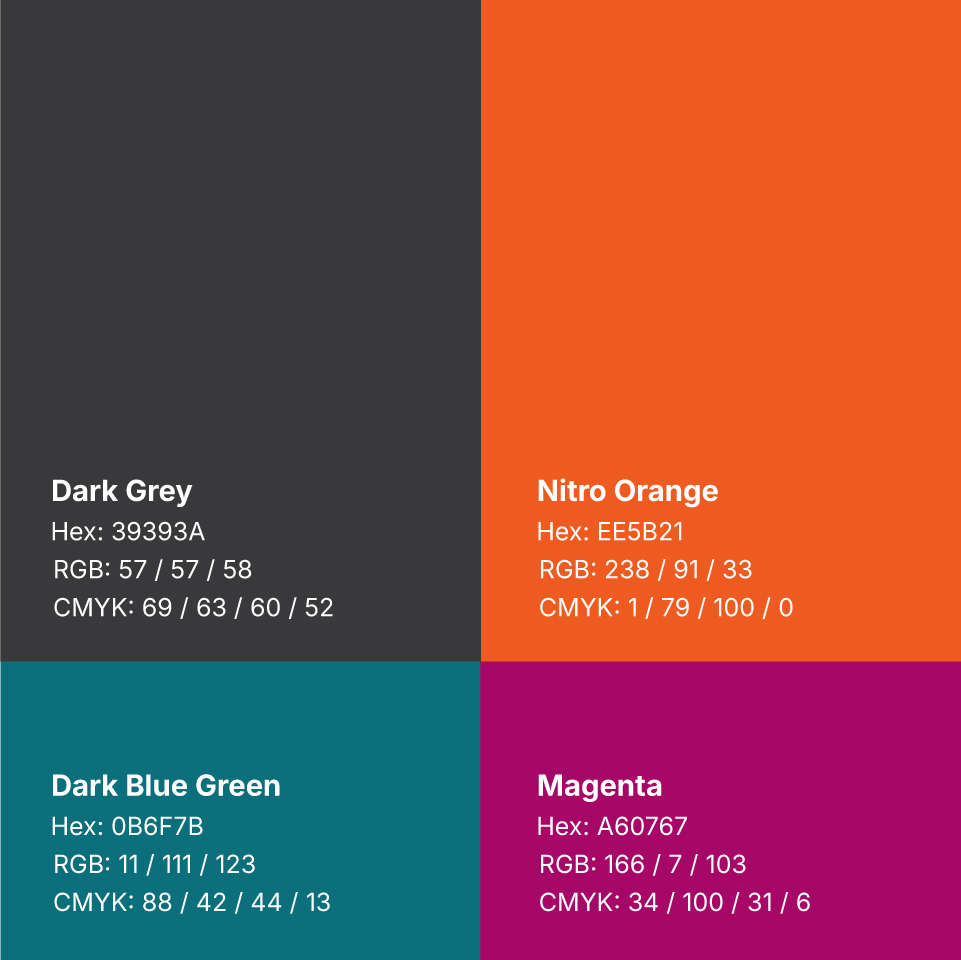
The color palette and typography needed to feel warm and approachable without losing enterprise polish, so both were built to pair with the illustration and photography system below rather than stand alone.


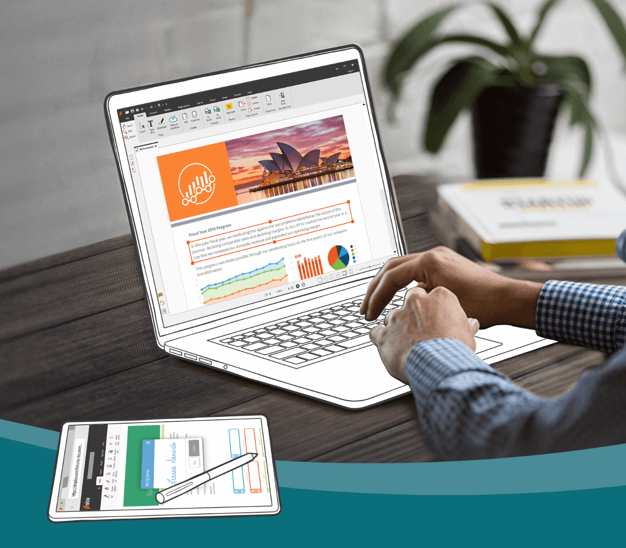
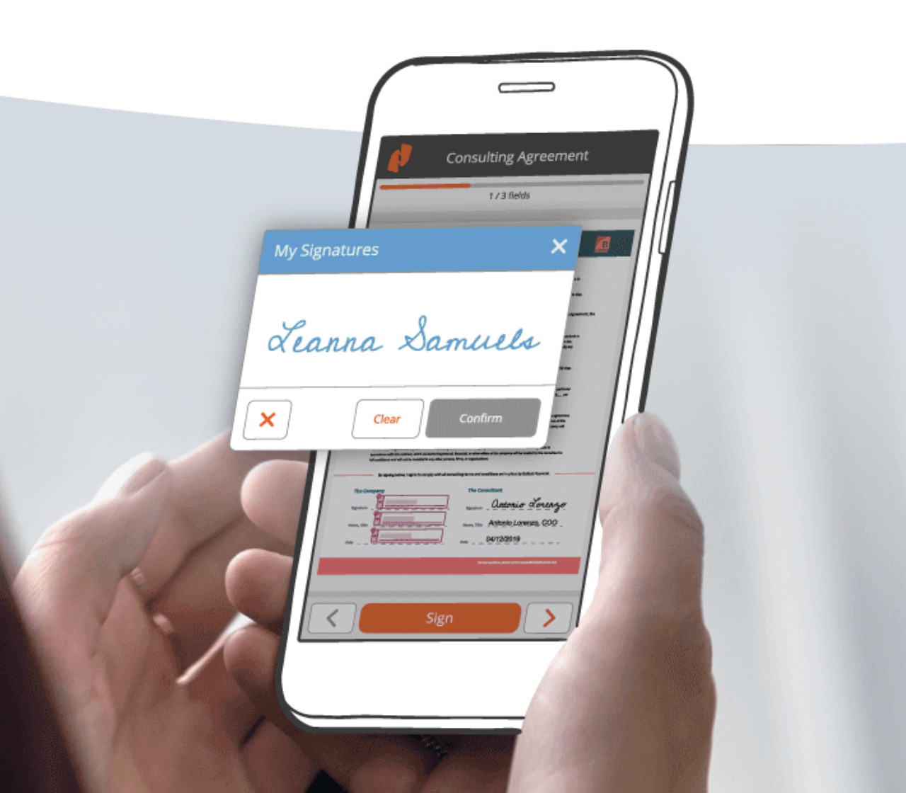
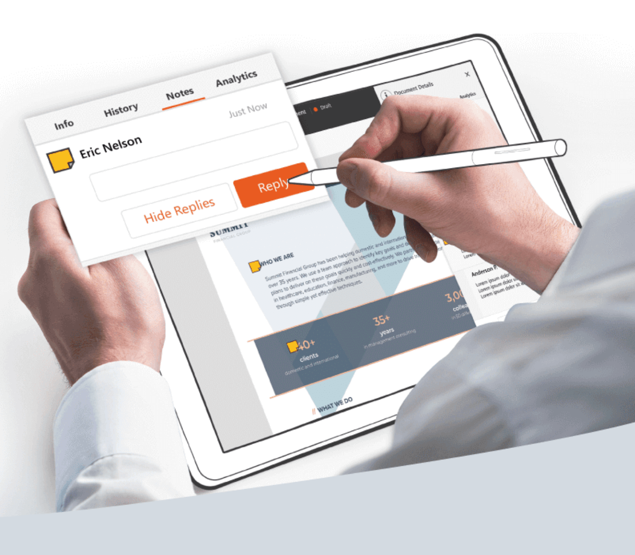
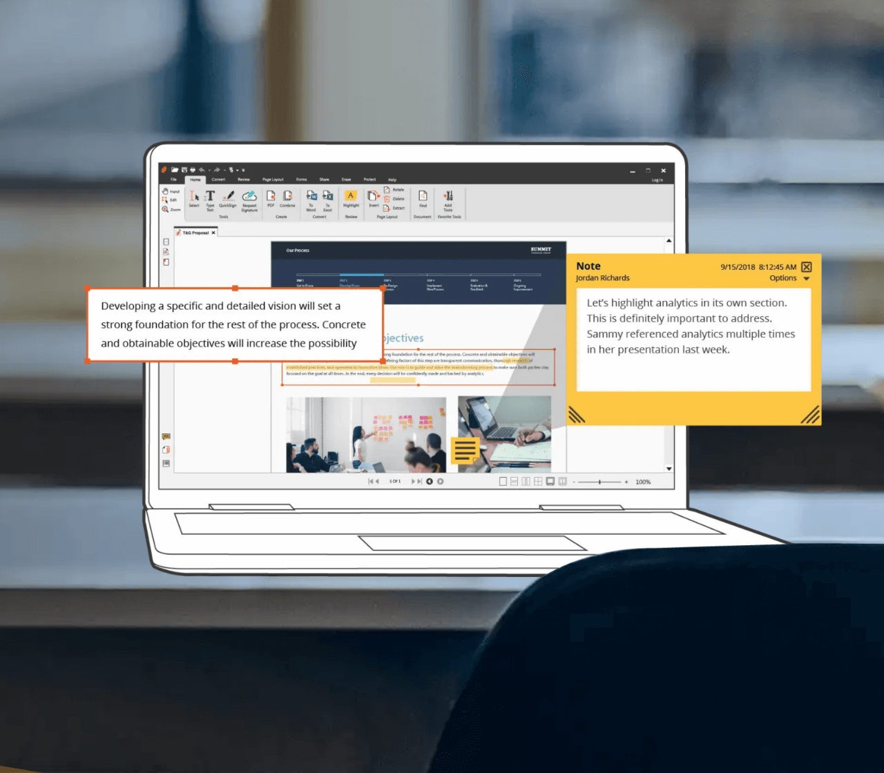
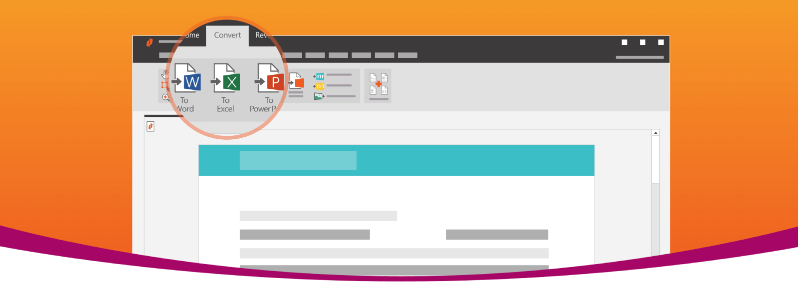
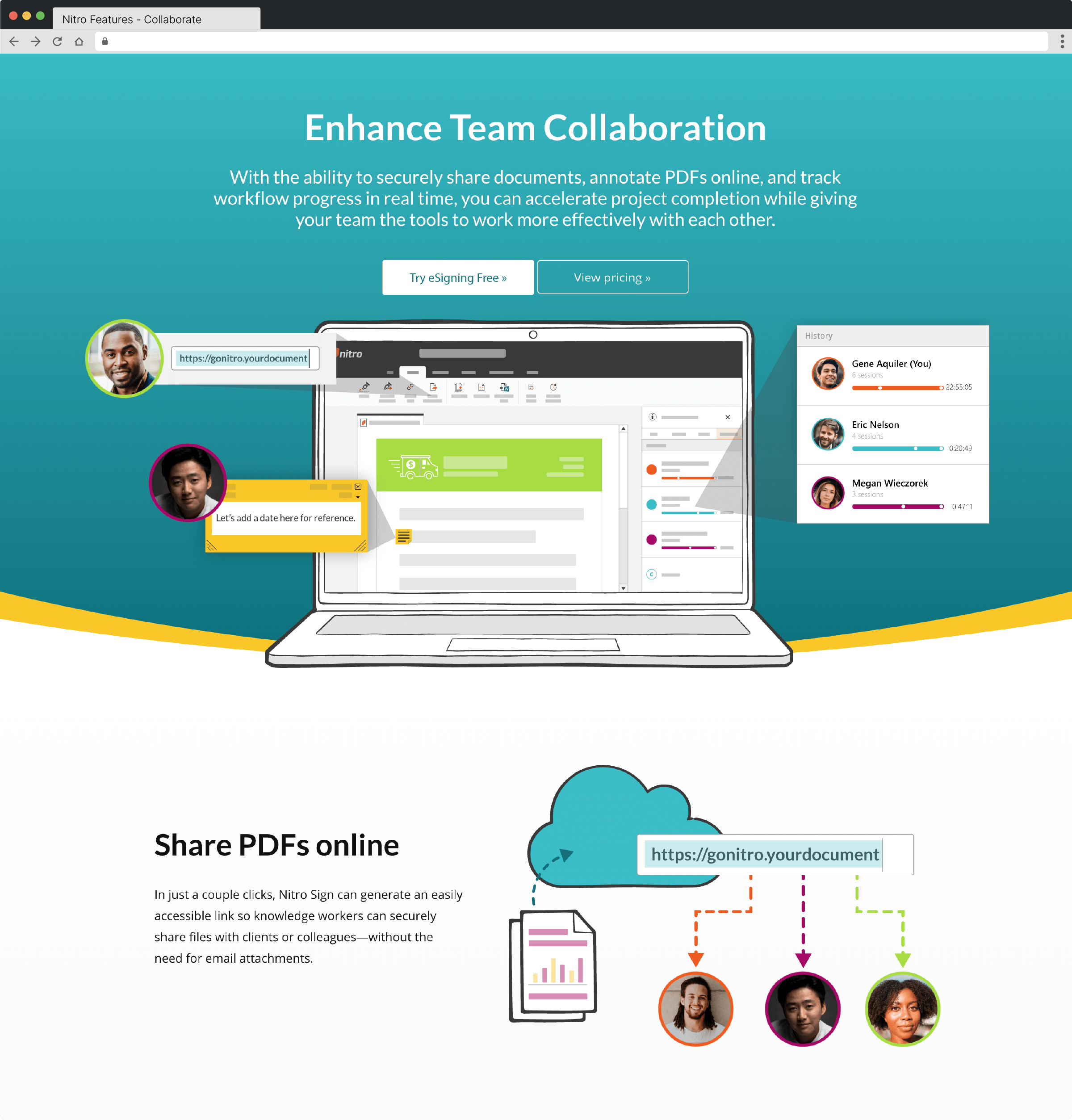
I introduced hand-drawn illustrations paired with real photography to bring a human element into what could otherwise feel like a purely enterprise product.


To keep that hand-drawn feel reproducible at scale, I created a library of custom brushes and shared it through our team's design library, so teammates and freelancers could extend the system consistently.


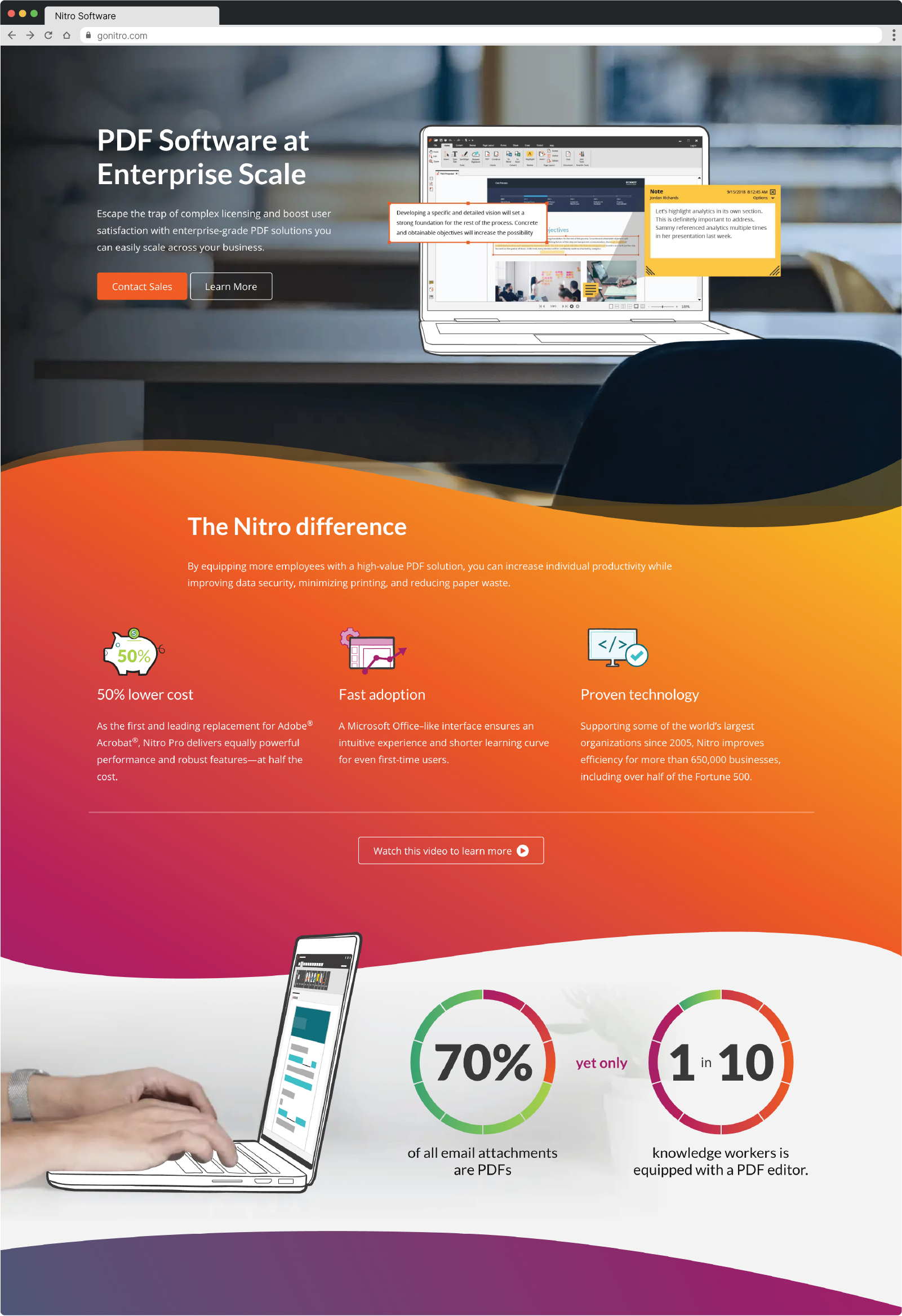
I brought in background gradients to add depth, and curve elements to break up sections of content and add a sense of movement. To keep those curve elements consistent from design file to shipped page, I built a library of inline SVGs and CSS classes for developers to implement directly.

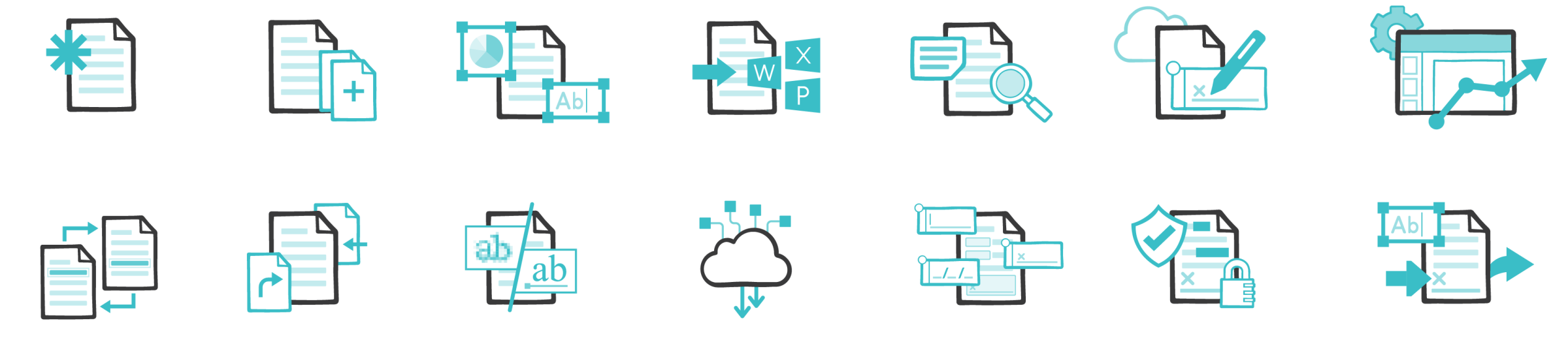
I also created a consistent icon style that was replicated by our entire team and by freelancers, maintained in the same shared library for easy collaboration.
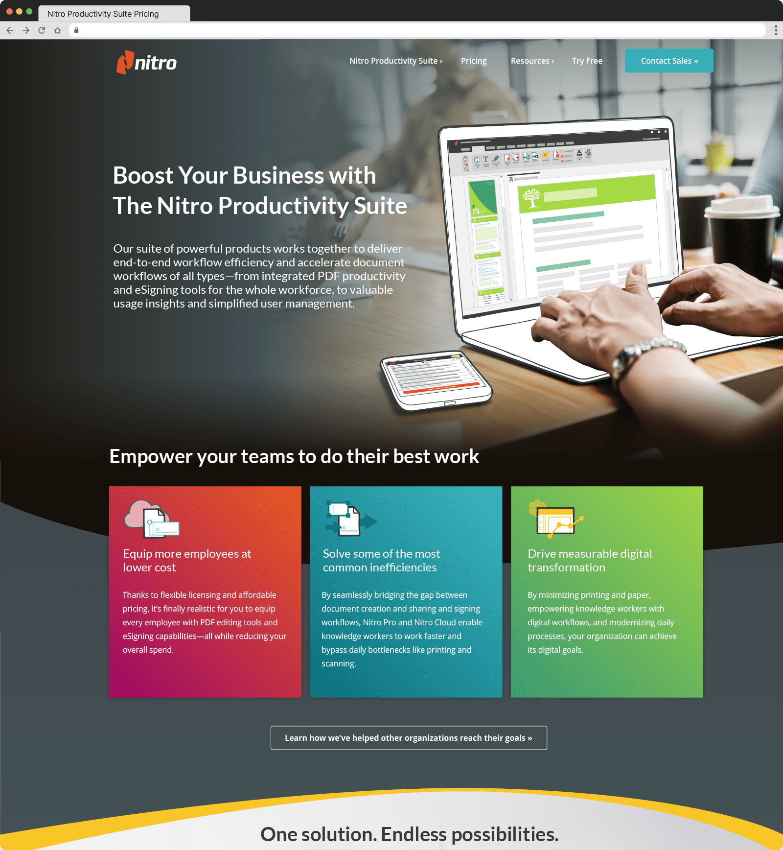
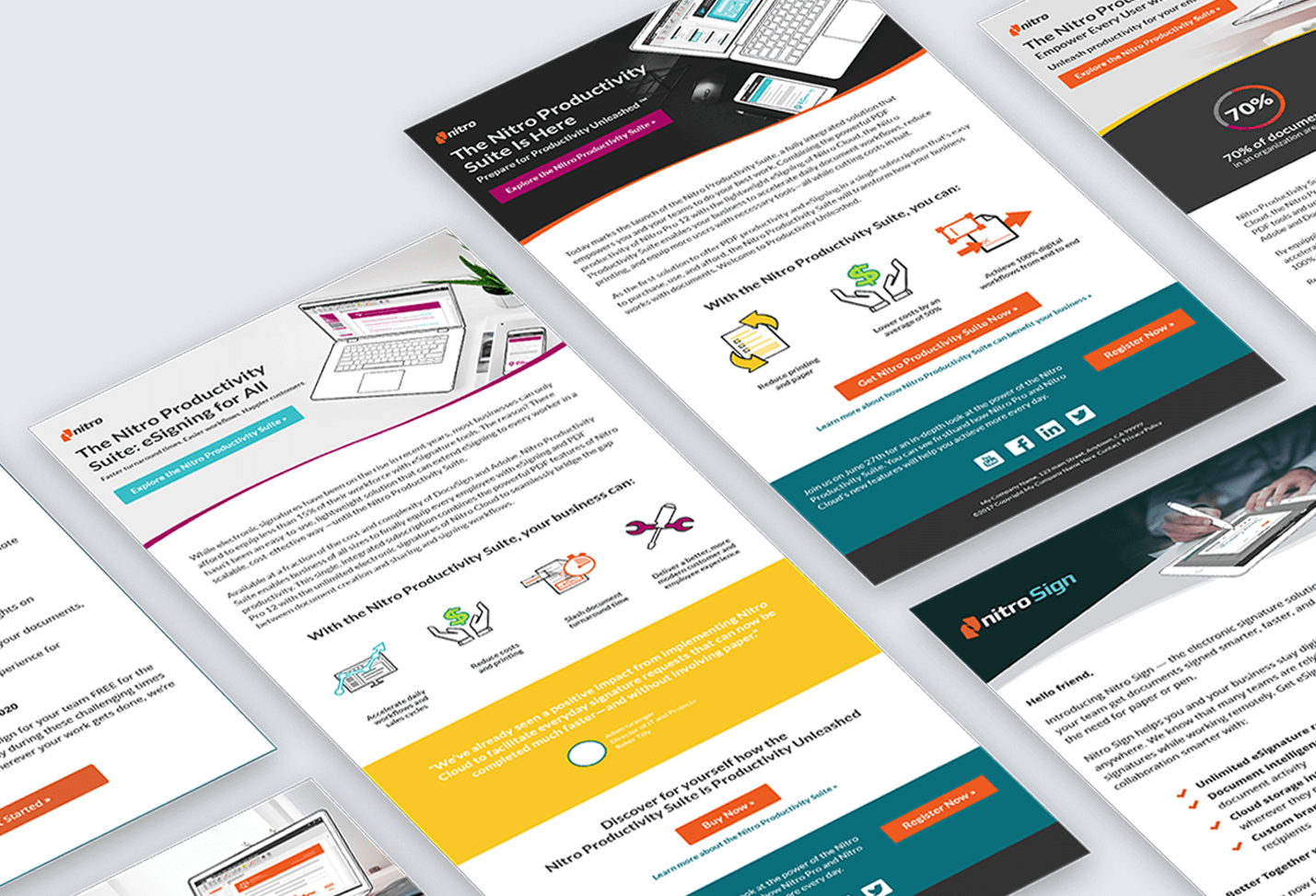
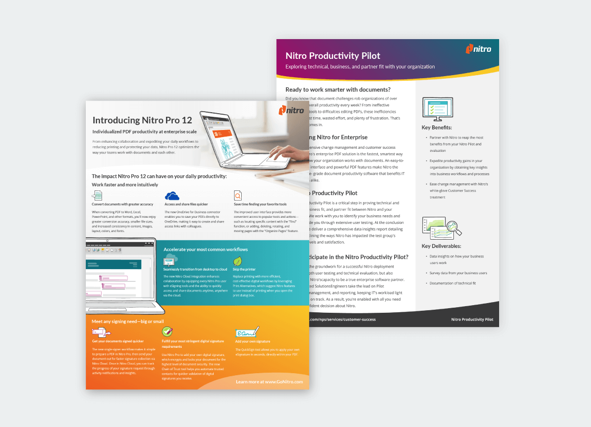
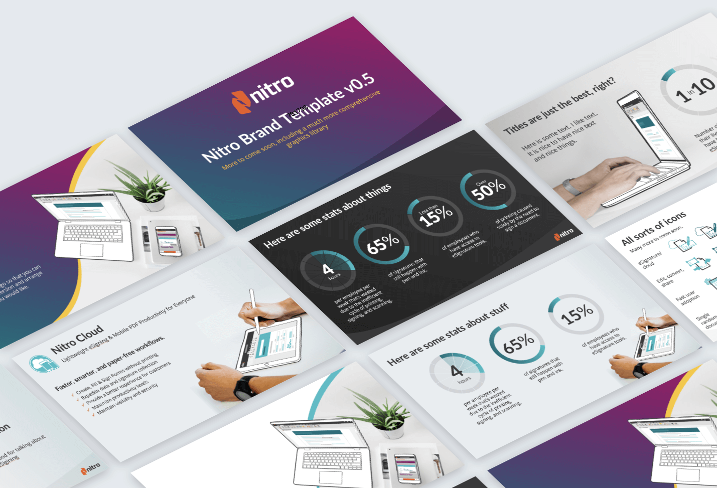
Over six months, the identity rolled out across the corporate website (re-architected, redesigned, and rebuilt), the product marketing pages for Nitro Pro and Features Cloud, sales one-pagers and presentation templates, and email. For Marketo, I designed and built every email module myself, then tested each one in Litmus across 28 email clients to make sure the brand held up consistently no matter how someone opened it.


I directed the design of a series of modules used in Marketo, Nitro's CRM — designing and building every module myself, then testing each one in Litmus across 28 email clients to confirm the brand held up consistently.


The response from customers and prospects was immediate and positive, and "Bold, Helpful, Authentic" became the shared language the company used to talk about itself — not just in marketing, but company-wide. I kept it that way by running quarterly reviews with the marketing team to check how well we were living up to it.
Nitro's Chief Product Officer put it simply:
The project also earned me Nitro's 2017 Employee of the Year award.
A brand system is only as strong as a team's ability to keep using it correctly after launch — which is why the shared libraries (illustration brushes, icons, SVG/CSS components) mattered as much as the pillars themselves.